Wednesday, 30 November 2011

Altering images.

Chris told us to investigate with layering images together or drawing over printed images, covering them with other items etc.

First I went out taking photos and these are the images I chose to experiment with..


I tried a few different things with cakes, cake sprinkles and layering images and these are my favourite..


Films.

With Chris the other week we watched clips from the films; L'eclisse, Stalker, Delecetessen,Waltz Brashir, Zidane, La Jetee and Sans Soleil.


These films weren't really my thing but I did get inspiration from La Jetee and Sans Soleil.


These were still images on a reel with music or a narrative to go along with it.

I really want to try something like this.


The new Rihanna video also begins this way and I think it's really intense, dramatic, and would work well in an assignment in the future.


I am going to continue into this research in my research file and at a later date.

Queens Hospital.

We were asked to produce images for the Queens Hospital to display on walls in the hospital, specifically by the canteen. This could of been of people, food, places etc.

Because of the idea that it was going to be around a canteen I immediately wanted to take images of food and related stuff, so me and Holly went back to her house to bake cakes and take vintage style images using these and related paraphernalia from around her house as her mum collects vintage items.

I found this brief really easy to follow and had thoughts straight away of what I wanted and how I wanted them to look.

I had a few issues with how bright the sun was shining through the french windows at the back of the house but working around this wasn't too difficult.

My final images.


Timeline.

We have been given a module surrounding the history of Photography & other arts e.g graphics in which we have to create a Timeline mapped out like the Tube map. It can be about anything related to the development of photography and art.


At first I didn't like the thought of this assignment because I couldn't really think where to start but after talking to tutors and friends I have understood it more and I have decided to start with the beginning of photography and how it generated from art, intertwining the lines on the map and then branching out to styles of photography e.g fashion, documentary, and what part they play against the main timeline of photography, then include art, graphics, and things like advertising.

I have decided to present my timeline on a big piece of card using different coloured pens. I will then put a title and image on a point in the line and create a key of numbers so that I can have a separate sheet of paper with an explanation.

I am going to start the timeline on Thursday 1st December and continue it up to and post christmas.

Friday, 4 November 2011

Craig McDean - Stylish.


Young Fashion Photographer Shoot.

I have settled on these iconic images to inspire my Young Fashion Photographer Of The Year Shoot.


This image is by Helmut Newton. He has created many iconic images and I really liked this one because of the composition, the expression on her face, the black and white textured feel to the image and the light and contrast of the image.


This image is by Peter Lindburgh in 1994 which is an iconic image of Kate Moss, it is inspired by the image below which was taken by Paul Strand and is an iconic image in itself. My final images


My models kept letting me down so in the end I got a wireless trigger from Vinny, set up the Canon 5D on a tripod and used myself as my model. I'm happy with my images. I think the contrasts are good and the composition is very strong. I prefer my first image to the one below because I think that one is too much of a copy of the image whereas the first one just took inspiration from it.

Craig McDean.

Stylish


Kirsten Dunst


Young Fashion Photographer Continued...

One image I am considering using for inspiration is of Sophia Loren.

I really like everything about this image, the fashion, composition, the distant look on her face. I like the old fashioned feel to this image but I will need to make my image more contemporary and up to date with the fashion choices I make.

Location - My house, preferably by a window to get the backlit look and to keep the natural light in the image.

Styling - I want a more up to date hair style, I'm thinking big hair, maybe curly or just backcombed. My model has quite thick black hair which I think should be made a focal point to my image, after the clothes. I want more bolder makeup but not so overpowering you loose focus on the expressions of the model. I have decided to keep the sun hat, as these are just starting to sell again in High Street stores and is coming back into fashion. Instead of a corset I'm thinking of using a modern black dress, hopefully one that comes in at the waist to accentuate my models tiny waist like the corset does in this image. Also, tights with a stocking look/print have been in fashion lately and so this is a contemporary twist on an old fashion style. The jewellery and gloves are something I haven't decided if I want to keep yet because I don't want to copy the image, although there are more fashionable up to date versions of these things available now e.g fingerless lace white gloves which I am going to investigate.

To make sure I don't copy this image I would try different angles and I want my model in different poses and positions to this image, so that I have taken inspiration from the clothes, but updated them, and her facial expression, but not copied the image exactly, mixing up the angles and style of the actual image.
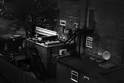
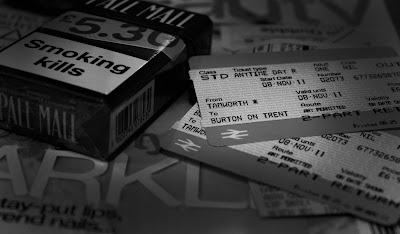
Young Fashion Photographer Of The Year.

Put your own spin on a famous photograph from the world of fashion.

Deadline: 14th October 2011.Age group: 16-25.

Clothes Show Live is the UK's largest beauty and fashion event. It is back this year to celebrate 23 years at the forefront of fashion and beauty.The Young Fashion Photographer Of The Year will be running as part of the Clothes Show Live Design Awards Programme.

The Brief is to take inspiration from an iconic image and put their own spin on it. Without just copying the image.I must enter one image with a short description about how I created the shot and a detailed explanation of the entry, alongside a copy of the image that inspired my entry.

Point, Line, Shape & Colour.

Point, line, shape and colour are the building blocks of design. From these elements, designers create images, icons, textures, patterns, diagrams, animations and typographic systems.

We got into small groups and went out around Burton taking at least four images to represent the words "point, line, shape, colour" however we wanted to using either a camera, videocamera or phone. I decided to use a Canon 5D because I enjoy using one and using a mobile phone doesn't produce high quality images so I could never use the images for anything else again.

We only had an hour to complete the assignment so we didn't venture out far, we decided to go down to the washlands and shoot round there. This was a good decision because there are a variety of interesting things around down there, and I discovered things such as a bright red metal gate to photograph.


Line

I don't like how obvious that this image shows line, but I like the image itself. I like the worn wood with the moss growin through. It shows age and you know there's a story behind the photograph.


Shape

When taking my images, I was thinking about overlapping some of the words, such as this image was for shape, but also works for colour and line.

I always think about depth of field, the rule of thirds, composition, how I want the image to look in camera and what I want to do in post production.


Colour


Point

www.digimatized.com


These images gave me inspiration for this brief. I like how they have taken a simple item such as a cone and just placed them in every day places and situations that then make thought provoking and interesting images, making a scenario that looks quite odd and not what you'd normally see or notice.

Monday, 17 October 2011

ROUND.

We were asked to produce an image to represent the word Round for The Guardian competition.
To be honest I really struggled with the whole concept to this competition. I didn't wanna do it, but I thought I'd give it a go, and I think that because it was something that didn't strike me as something I enjoy I knew I would struggle with the brief.

The trouble I had is I didn't want to take something to cliche or obvious, so trying to think outside the box for "round" i found hard.

Me and Holly went out together for this one, just to get it out the way so we could concentrate on practising with the location lighting kit because it was something we'd both enjoy more.

I wasn't overly impressed with our images.


I did enter the competition, but using an image I'd used for the typography brief we had, which was acorns in a circle because it was hot weather but it was autumn, and I thought it showed that just because the weather doesn't show it's autumn, there are things that give it away.


Location Lighting

We were given a worskshop on how to set up the studio lighting which I found really helpful. I was comfortable with using the location lighting but not on how to set it all up and break it down afterwards. I now feel a lot more comfortable with booking out the lighting for my own shoots.

We were then sent out with the lighting kit to photograph portraits around Burton whilst the statutes were on. We were given everything we needed including modifiers of our choice, reflectors etc.

My group went out and set up where there were people walking past but where the wasn't too much noise or distractions. We found that a lot of people didn't want their photo taken, but there was still hope as some did. Unfortunately one of the members of my team offered "free portraits" instead of asking if they would sit for us. So it fell down to me to email some images free of charge to some of the participants.

We used intsinct to decide where the light should be because the sun was very strong that day, and me and Holly took it upon ourselves to figure out which stop we wanted it on including tenths of a stop, and I think we worked it out bang on.

The images we produced were well lit and strong images, and I was very impressed with the outcome. I will be using the location lighting a lot more often now I feel so much more confident with setting it up and I know I can produce amazing results using the kit.

Favourite images I took that day.


Wednesday, 12 October 2011

Typography.

"Create a set of experiments using different mediums (collected objects) to visualize a font and words, photograph them to document, this can be any word you like in any font style, just remember certain fonts will not match the style or give the right impression of the words you have chosen, for example - using a light thin pink font to show a word like strong or danger."

We had to take one of the 5D's out and work in a group of three to photograph different objects around Burton to make letters, e.g sticks to make a letter L and so on.

"Research - Look into photography and the different forms it takes. Select half a dozen words and find out their meanings. Find old boxes sweets etc think about how buildings form shapes and how light falls on objects."

I went out and found old objects lying around Burton to create letters and words. Finding such things as sticks, crisps, leaves, berries, acorns, I also used buildings, scaffolding and signs to try to create letters.

My preconceptions of the brief before setting out is that it would be easy, but I actually found it to be more challenging. I wanted to think of some more "out there" ideas and attempted to use things like scaffolding to create letters but it didn't show through the images.


I think that some of our images came out well such as these ones below.


We were then asked to choose an image we already had and create a magazine spread with the image on one side and a word on the other side.

I chose the words "Love Yourself" because the image I chose was for a project I did about beauty and how beauty is perceived differently from person to person. I named the project natural beauty, and that's why I chose the words love yourself.

What To Photograph?

The first brief given to me was on the first day of the course. The title "What to photograph?" was set. The brief was for the class to think of 17 different words and then to go out in Burton in pairs and photograph each of the words.

I decided to approach the task word by word, to think of ideas for each word in my head beforehand, as well as looking around for inspiration around Burton. I believed this was significant to the fact some of my images showed my thought into the words, where as I felt some images were weak in comparison because I hadn't had many ideas before taking the photos, it was a spur of the moment image.

Knowing a lot about Burton from doing the National Diploma previously, I already had some preconceptions on where to go for certain words and what I could look for in Burton I.e - Stripes - Frankie & Benny's has stripes on it's canopy and I had formed an idea of how the image would look in camera before even leaving the college, and something worn as i knew of an area of town with many worn down shops and buildings.

Some of the words or phrases I found more difficult because they didn't provoke much thought or I hadn't seen something I knew I could use beforehand. These were words/phrases such as "A moment in time". I also struggled with ideas for a few words such as travel at first because although a lot of ideas came to me, I wanted to think more outside of the box than something obvious or cliche such as a train, a train ticket or a bus or taxi, but in the end me and my partner did come up with some obscure ideas for such words. For example for travel we came up with the idea for the Royal Mail, or some form of Courier service as they travel all over the country, and ended up with an image of a postbox, although I would have liked a photo of a courier van or post van.

To improve on the images I produced I would sit down and rethink some of the obvious images such as a speedometer for "speed" because other people in the group had the same idea or someone cutting hair for "hair" but within the time frame given for the Brief I think some of the images I produced were well thought and produced well in camera so not much post production work was needed, mine and my partners images for "something blue" "something old" and "travel" I am proud of and convey the words well without taking the obvious route. Time management is something I need to consider on future briefs as I spent too much time on each image to try and make it perfect at first so that as time started to run out I didn't think through my latter images enough and had to use what I had without it being something I was particularly impressed with.